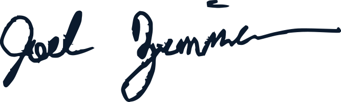
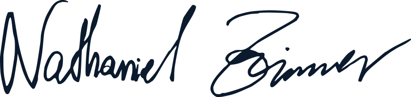
This guide changes one way: a proposed edit in writing, approval by Joel Zimmer and Nathan Zimmer, a version bump, and a row in this table. No silent edits, ever. The same table is published for machines at /ai/brand-system.md, so an audit report can name the exact version it was measured against.
| Version | Date | Owner | Changed | Approved |
|---|
| 8.0 | 2026-08-25 | Nathan Zimmer | Two things a partner reaches for, both of which the system published and neither of which worked. First, the favicon. EVERY1 declared a transparent SVG as its browser icon, and a transparent favicon takes the tab’s own colour behind it: on the light chrome most systems ship, the reversed file’s white E disappeared and the tab showed a lone Flame 1. The door was being recognised by half its own icon. The favicon is now a plated PNG carrying the two-tone mark, Midnight and Flame on White, published at 32 and 48 as the parent portal already does. The app-icon ruling stands and gains its reason: one mark everywhere, and the plate follows the surface, which is the rule every ink on this brand already follows. Launchers, profiles and every avatar stay reversed on Midnight. Gate L21 measures the pixels rather than trusting the constant, so a transparent favicon, or a plate change that erases half of a two-tone mark, fails the build. Second, clear space. It has been published per mark since v4 and measured rather than estimated, and a person placing a logo in a slide still had to read the number, do the arithmetic, and eyeball a margin. Every mark now also ships a -clear PNG at every width and in every ink, with its own recorded clear space inside the image: the rule travels in the file rather than in a caption beside it. 96 new files on EVERY1 alone, all declared and all served. EVERY1’s download pack was vector only, so the door whose call to action reads “Download every mark” handed a partner no raster at all; it now carries every published EVERY1 file, both PNG sets and the icon set. No colour, typeface, or law changes. | Joel Zimmer · Nathan Zimmer |
| 7.9 | 2026-08-24 | Nathan Zimmer | EVERY1’s own site stops carrying the parent’s serif. §11 has said since v5.8 that sub-brand materials are DM Sans led and the serif appears only where the parent speaks, and the site at brand.every1movement.com broke that rule on every headline: the page title, every section heading, the step numerals, the vision lines and the messaging standard were all set in DM Serif Display, so the movement’s own front door read in the institution’s voice. Every one of them is now DM Sans, the family the mark is drawn in, and the door page’s blocks take the same face when they are lifted onto the movement’s site. One serif remains, on purpose: the vision verse, which is scripture and is set under §04’s scripture rule in DM Serif Text with a hairline above and the reference beneath, because that is the parent speaking. The site’s type section and its manifest now publish two faces and the rule between them rather than repeating the parent’s three, the door’s guide states the rule among the rules that differ from the parent, the messaging standard self-hosts its faces like the rest of that site, and the linter fails an EVERY1 page that sets the display serif anywhere or the text serif outside scripture. No colour, typeface or law changes; a standing rule is enforced where it was being ignored. | Joel Zimmer · Nathan Zimmer |
| 7.8 | 2026-08-22 | Nathan Zimmer | §11 rules how this house behaves across a border, which it had never said. Country lockups existed and G7 failed flags, and nothing reconciled the two or answered the question a product actually asks: should this feel like it belongs to the country it is opened in? It should, and the way is not the obvious one. The layers are split and only one moves: colour, type, geometry and motion never change at a border; the mark changes once, through a published country lockup, which is the single place a flag appears; and language, photography, testimony, first steps and formats should change in every country. The reasoning is on the record, including that the USA lockup already refuses its own flag’s red and blue for brand colours, that a national accent collides with the functional palette (Nigeria’s green is ΔE 3.6 from the salvation colour against a published floor of 8.0), and that the vision names the tribe before the nation, so a national treatment writes out the believer this movement is most for. G7 widens to name national theming of the system explicitly, and records the country-lockup flag as its second exception. The ruling is published as data at nation, layer by layer, so an application crossing a border reads the answer rather than asking for it. No colour, typeface or law changes. | Joel Zimmer · Nathan Zimmer |
| 7.7 | 2026-08-22 | Nathan Zimmer | Every scale publishes the rule that governs it, not only its values. The EVERY1 platform build asked whether a pill radius exists and whether a spring animation is allowed. Both were already answered in this guide, in §09’s captions: “nothing in this system is a pill” and “nothing bounces, nothing springs”. Neither reached /ai, so two products were built against a standard that forbade what they built, and neither team could have known. Every data-scale table now carries a data-rule, published at scaleRules, and the linter fails a scale that ships values without one. This is the same failure as v7.6’s D6: the brand had the answer and the machine layer did not carry it. §04 also publishes the scripture treatment as data rather than prose, and the page edge inset is fixed at space-5 on every surface, a phone included. The EVERY1 manifest corrects its own claim that a 404 returns a non-HTML body: it returns HTML on purpose, and the status code is what to trust. | Joel Zimmer · Nathan Zimmer |
| 7.6 | 2026-08-22 | Nathan Zimmer | The product release, answering the EVERY1 platform build’s two written requests. §03 states what “a tenth” is measured against, and narrows the Flame text rule to the light grounds it was always about: on Midnight, Flame is the text accent, because Ember is 3.25:1 there and fails. §04 answers weight, tracking, italic and figures per step, sets the scripture treatment, and rules that the faces are self-hosted on the web and bundled in an application. §09 adds functional colour the identity palette never covered: six outcome colours and a nine-step progression ramp, each value derived rather than picked and gated on 4.5:1 in both themes and ΔE2000 8.5 separation under normal vision and all three dichromacies. The neutral ramp gains ink-reversed-faint. Every permitted and forbidden contrast pair is now measured and published at /ai/tokens.json rather than left for each surface to compute. On the delivery side: the EVERY1 site now serves all 120 files its manifest declares rather than 40, returns a real 404, publishes brand_check.py, and carries a SHA-256 on every declared file. The app icon contradiction is resolved in favour of the E1 icon. | Joel Zimmer · Nathan Zimmer |
| 7.5 | 2026-08-21 | Nathan Zimmer | EVERY1’s door gets its words. An audit of the movement found the mark system in good order and everything downstream of it missing: the site published eight lockups, six colours and three faces, and not one line about what to say. An organisation carrying the mark at a conference got the artwork exactly right and then wrote its own copy, which does more damage than a stretched logo and is harder to take back. Four things are fixed. First, the vision is published as text. The vision lockup was described as carrying the whole promise, and that promise existed only as outlines inside the artwork: Every tribe, every tongue, every nation will know the name Jesus. A partner could put it on a stage backdrop and could not quote it in a program or check a translation of it. The site’s own footer had been quoting the first half and stopping. Second, the words themselves are on the site: the mission, the promise, what the movement is, who may join, the first three steps, the four phrases it carries, how to write as EVERY1, the banned words, and a boilerplate paragraph to be used as written. Third, the app is specified rather than pictured. EVERY1 is a movement, an app and an activation platform, and the app had one image and no design. Eight screens are named with their one action, their marks, their ground, their empty state and their error state, plus nine rules that hold across all of them. A mockup is correct the day it is exported and silently wrong after the next token change; a spec generated from tokens moves when the brand moves. The 1 as a mask gains an interface rule it did not have: one per view, because a scrolling list would put six on screen and turn the signature move into wallpaper. Fourth, the messaging document stops contradicting itself. Section 1 told every reader that the initiative carries the endorsement line and Section 8 told them EVERY1 carries none, because the sentence was written once for all three doors. Section 1 now reads the rule that applies to the door it is describing. The words are stated once, in ai-source/every1-messaging.json, and read by both the document generator and the site generator, so the words a partner repeats and the words on record cannot drift. They ship in EVERY1’s machine layer too, so an agent writing a caption gets the language along with the artwork. Two audiences are recorded for this door, The Sent Believer and The Partner Organisation, with twenty-three approved strings written against them: the copy bank held forty-seven strings and none for the people this movement is actually for. An unrecognised audience now fails the build, which nothing checked before. The vision and the mission are also restated in this version. The vision reads Every tribe, every tongue, every nation, and EVERY1 will know the name Jesus (Hebrews 8:11), and it is now read from this guide rather than retyped: the EVERY1 site had been carrying a shortened form that dropped and EVERY1 and with it the reason the wordmark sits inside the sentence. The lockup is not a logo placed between two lines. The mark is a word in the sentence, and read top to bottom the lockup says the vision in full. EVERY1’s mission becomes Empowering the local church to walk in unity to do the great commission & walk in God’s calling (Acts 2:17). It was stated in five hand-edited places and all five now agree. | Joel Zimmer, Nathan Zimmer |
| 7.4 | 2026-08-20 | Nathan Zimmer | EVERY1 gets its own front door at brand.every1movement.com, written for the people who were never going to read this guide: our own team, and any organisation carrying the mark at a conference or an activation. It leads with how to use the mark rather than with how the system is governed. Which file for which ground, the room each mark needs, the smallest it may be set, the six colours, the three faces, the short list of things that break it, the 1 as a mask, and how to ask for a country that is not drawn yet. It is a second site, not a second system. One repository, one build, one linter and one version number, published twice, which is what stops the two drifting. Splitting the machinery would have handed back the single thing that makes any of this trustworthy: that nothing here can disagree with anything else. It is also self-contained. The site carries its own copies of the stylesheet, the three faces and its own marks, because a partner downloading a logo should never be sent to the parent’s domain, and the door that stands alone should not go dark when that domain does. Two roots meant the linter had to learn that a page under every1/ resolves its links against every1/, not against the repository; without it every correct link on the new site read as broken. A fork becomes the right answer the day EVERY1’s palette or typefaces diverge from the house, or the day a separate team owns it with no shared review. On that day the structure is EVERY1 consuming @theword/brand as a dependency rather than copying it, which is already built and waiting. | Joel Zimmer, Nathan Zimmer |
| 7.3 | 2026-08-20 | Nathan Zimmer | The favicon stops disappearing on dark browser chrome. The microphone is knocked out of the disc rather than drawn as a shape, so the small favicons, which had no ground behind them, were a Midnight disc with a transparent microphone: on a dark tab strip both vanished and the icon was simply gone. Every size now carries the Midnight plate that the touch icons already had, so the mark reads on any chrome at 16, 32 and 48 as well as at 180, 192 and 512. No artwork changes and the glyph itself is untouched. What this does not do is make the microphone white. The microphone is negative space carved by the disc’s own outline, not a separable shape, so no build step can fill it; only the capsule can be reached, and a capsule on its own reads as a pill rather than a microphone. A white microphone needs the glyph redrawn with the microphone as a positive shape, which is recorded here as the open question it is rather than approximated. | Joel Zimmer, Nathan Zimmer |
| 7.2 | 2026-08-20 | Nathan Zimmer | EVERY1 becomes a standalone identity, and the exception already on record says what it now covers. It was written for “the future EVERY1 app”; what it covers is the movement, the app, and the activation platform together, because people join all three before they have heard of the house behind them. §11 records it, and gate G6 records it the way G7 already records the School’s seal. Law III does not change: every other door carries the endorsement without exception, and this remains the single case on record. On EVERY1’s surfaces there is no parent lockup and no endorsement line, and its guide says the line is not merely optional there but wrong. EVERY1 enters the logo build as a brand in its own right, replacing six hand-placed files that nothing verified. Eight masters, twenty-four published SVGs and the rasters beside them, each with a recorded clear space, minimum size and aspect: the horizontal lockup, the bare wordmark, the E1 icon, the numeral, the vision and promise lockups, and country lockups for USA and Uganda. Its numeral stays Flame on a dark ground where RTMC’s brackets collapse to white, because Flame on Midnight is 5.4:1 and the 1 is what this door is recognised by. The country bar is a new kind of part: its colours are its country’s flag, which is a recorded exception to the six-colour palette, with USA the single exception to that exception because its flag is close enough that a true red and blue reads as a mistake. A segment that would vanish into its own dark ground is lifted rather than published invisible. A country lockup carries its name as outlined type, so the build cannot compose one: each is drawn in the EVERY1 Canva file and arrives through the drop zone, which the guide now states. The 1 is published as a mask, this door’s one move no other door has, with its ratio written from the artwork so it cannot drift out of proportion. Four design mockups are published as mockups, recorded in the inventory as generated and never as the record. No colour, typeface, law, or other door’s mark changes. | Joel Zimmer, Nathan Zimmer |
| 7.1 | 2026-08-20 | Nathan Zimmer | The palette gets its print figures. §03’s print table now carries a nearest Pantone Solid Coated colour for each brand colour and, beside it, the CIEDE2000 distance to it. The distance is published because every one of them sits between 2.5 and 4.6, which is to say visibly different: none of these five colours lands on a standard Pantone, and a printer should expect to mix rather than pull a book colour. White carries no Pantone at all, being unprinted stock or opaque white ink. The matches are computed by tools/match_pantone.py from a reference set of published screen approximations kept in ai-source/pantone-reference.json, so the derivation is reproducible and correctable rather than being a number nobody can explain. Both columns stay marked unconfirmed until a press proof says otherwise, and a corrected value returns here through a changelog entry. Canva: the five approved marks are uploaded and filed in a versioned folder, taken from their published URLs so the files there are the published files. The kit’s colours and fonts still have to be set by hand, because Canva’s API is read-only for both. | Joel Zimmer, Nathan Zimmer |
| 7.0 | 2026-08-20 | Nathan Zimmer | The toolkit release, answering the first system review (The Toolkit Gap). The guide stated six colours and three typefaces and stopped, so everything below that line was being invented per project. §03 gains a neutral ramp derived from Midnight and Parchment at recorded opacities, so dividers, placeholders, input fills, and disabled states stop being improvised and the palette stays six colours; it also gains the palette in CMYK, recorded as an unprofiled starting point and marked unconfirmed, with Pantone left bracketed until the marks are matched to a book. §04 gains a type scale of eleven steps, each naming its own family. §09 gains spacing, radius, elevation, motion, three breakpoints, a 44px touch target, and error and warning states, with the rule that neither may ever be Flame or Ember: Ember means “this is the action”, and an error is not an action. Every scale is published as a data table the build reads, so the guide remains the only place a value is stated. From it the build now emits brand.css, a tokens-only stylesheet every page in the portal links instead of carrying its own copy of the palette, a W3C Design Tokens file, typed TypeScript, a Tailwind preset, an Adobe swatch file, and two installable packages. The component set grows to forty, adding the interface parts every application needs and none of the guides happened to use: badges, alerts, tabs, breadcrumbs, pagination, an accordion, a dialog, a menu, a tooltip, a toast, progress, skeletons, an empty state, an avatar, checkboxes, radios, a switch, a form field, a data table, an email layout, and an email button. §09 gains a dark theme: a recorded surface for a raised card on a dark page, and lifted success, error, and warning values, because the light ones measure between 1.9:1 and 3.0:1 on Midnight and cannot be read there. The accent changes with the ground for the same reason, Ember being 3.3:1 on Midnight, which makes the Flame eyebrow §03 already specifies a rule rather than an exception. All forty are rendered live at /components/, on either ground, drawn by the published stylesheet, one component per screen rather than one continuous page. A governance section at /governance/ separates three things that had been reading as one: a policy is a standing rule about how the system is run, a process is the order work moves in, and a procedure is the steps for one job. Ten policies, five processes, and eight procedures, each held to one line by a build check, and the brand's own non-negotiables read out of the audit's gates rather than restated. A channel layer at /channels/ records the sizes, character limits, and safe areas for nine surfaces, with a bank of pre-approved copy checked against its own limits and against the banned-word lists at build time. One logo correction: the School’s co-brand lockup reversed its own mark but left THE WORD in Midnight, which on the School’s Word Blue ground is 1.6:1 and effectively invisible. A composed lockup now tags its parent half so an ink can colour it separately from the door’s own mark, and on the reversed ink the parent and the divider rule flip to white while the lion keeps its Midnight structure. No colour, typeface, or law changes: this release adds what was missing rather than altering what was there. | Joel Zimmer, Nathan Zimmer |
| 6.8 | 2026-08-20 | Nathan Zimmer | The School’s reversed mark is shown on the ground it was drawn for. Its lion is structured in Midnight, so a Midnight display ground swallowed that structure and the mane flattened into a white silhouette: the artwork matched its source exactly, and the ground under it did not. The dark ground is now declared per door rather than assumed to be Midnight, and the School’s is Word Blue, on the assets page and on its own guide alike. §11 states the rule instead of leaving it to be discovered, and names it as the case §04 already forbids for Word Blue on Midnight: ink and ground must not be the same colour. No logo file changes. | Joel Zimmer, Nathan Zimmer |
| 6.7 | 2026-08-20 | Nathan Zimmer | The School’s published forms are matched to the artwork as supplied. The files handed over are a pure recolour of the earlier set, verified path for path: geometry is untouched and only the fills moved, from #052744 and #99daff onto Midnight and White. The lion is Midnight over White and the name Word Blue, with one exception carried from the source: the horizontal lockup inks its lion Word Blue on light grounds, where the stacked lockup and the lion alone ink it Midnight. §11 records that exception rather than hiding it. The build gains per-configuration ink overrides so a single form can differ from its brand without a second master. Group wrappers are no longer painted, since every path carries its own fill, and a check now fails the build if that ever stops being true; roles are pushed onto the paths themselves so a re-ink cannot depend on nesting the textual pass cannot see. | Joel Zimmer, Nathan Zimmer |
| 6.6 | 2026-08-19 | Nathan Zimmer | The School’s ink is corrected against its Canva source rather than against the files it was built from. The SVGs supplied to the repository were a stale export carrying #99daff and #052744; the live Canva design had already been moved onto the palette and uses only Midnight, Word Blue, and White. Sampling it settles the question the last two releases guessed at: the lion is Midnight over White and does not change on any ground, and the name beside it is Word Blue, flipping to white on dark. This supersedes v6.4, which inked the whole mark Midnight, and v6.5, which inked the whole mark Word Blue. Geometry was checked against the source at the same scale and matches to within a quarter of a percent, so only colour moved. Every School form, its co-brand lockup, and its pack are regenerated. | Joel Zimmer, Nathan Zimmer |
| 6.5 | 2026-08-19 | Nathan Zimmer | The School of the Local Church is re-inked from Midnight to Word Blue. Word Blue is already this door’s ground in §11, and the mark was supplied with its wordmark in Word Blue before the two-tone reduction moved it to Midnight; this restores it. The reversed form gains from it: on the School’s own Word Blue ground the lion’s structure now disappears into the ground exactly as the open interior intends, rather than sitting a shade darker than it. Every School form, its co-brand lockup, and its pack are regenerated. | Joel Zimmer, Nathan Zimmer |
| 6.4 | 2026-08-19 | Nathan Zimmer | The School of the Local Church has an approved mark, and §11 changes to record it. It is the Lion of Judah wearing a crown beside the School’s name, and it replaces the shield-and-ring academic seal this guide had required since v5.8 and which was never drawn. Supplied in four colours with the text in Word Blue, it is reduced to two tones inside the palette: the light blue was a seventh colour, and a Word Blue midtone tested too close to Midnight to hold the mane. The lion’s interior is left open rather than filled, so one drawing serves both grounds: on paper the ground shows through white, on Midnight the same artwork reads as a white lion. Published in four configurations at /assets/logos/school, each in two-tone, reversed, and one colour, with a co-brand lockup composed from the two approved masters. The School’s door now opens with its own mark rather than the parent wordmark beside TRAIN, and carries the co-brand lockup in its navigation as Revival To My City does. Both doors now publish the link to their editable source. Revival To My City’s mission line moves below its footage to open the content rather than the page. | Joel Zimmer, Nathan Zimmer |
| 6.3 | 2026-08-19 | Nathan Zimmer | Revival To My City is redrawn from type rather than from a trace. The mark supplied at v6.2 was an outline trace: every curve was a dense polygon, which is the worst failure mode for a hairline serif and was recorded as an open gap against large-format use. The replacement is set from the licensed faces and exported as real font outlines, so the artwork now carries 265 true Bezier curves where it carried none, and the large-format gap is closed for this door. THE WORD’s own masters are still a reconstruction and that caveat now names them alone. The supplied file arrived without the brackets, so they are constructed by the build to fixed proportions of the sub-line cap height: arms at 0.54, stroke at 0.114, and an even 0.42 clearance on all four sides. The sub-line is shifted 11.51 units left so the closing bracket lands just inside the L, as the approved artwork has it; no letter path is altered. Two empty groups in the supplied file were being turned into opening tags by the ink pass, which detached the brackets from the words in every single-mark form; the build now leaves self-closing groups alone. Every RTMC form is regenerated, including the composed co-brand lockup. | Joel Zimmer, Nathan Zimmer |
| 6.2 | 2026-08-19 | Nathan Zimmer | Revival To My City has a new approved mark, and §11 changes to admit it. The mark is a serif: the swash R is Hello Paris, EVIVAL is ITC New Baskerville, and TO MY CITY is DM Sans, all converted to outlines. It is two-tone, Midnight with the brackets around MY CITY in Word Blue, and those brackets are a field rather than a flourish: the two words inside them are what a city replaces with its own name, and that is the only permitted change to the artwork. The supplied file carried 24 sliver artifacts in the accent path, which showed as blue hairlines across the R, and two off-palette colours; both were corrected before approval. Published in five forms at /assets/logos/rtmc, replacing the heavy DM Sans lockup with the Flame tick, which is retired to archive/. A co-brand lockup is published and generated by composing the two approved masters rather than drawn a third time, so it cannot drift from either; it carries the endorsement by showing the parent instead of stating it, and it is what the Revival To My City guide now uses in its navigation. §11 no longer requires one shape of every door: it requires outlines, the palette, and an endorsement carried one of two ways, and it records that a door may use a licensed face at the cost of nobody being able to extend that mark. Minimum sizes for both new forms are set from a legibility test rather than estimated. | Joel Zimmer, Nathan Zimmer |
| 6.1 | 2026-08-19 | Nathan Zimmer | EVERY1 has an approved mark. The supplied artwork is redrawn as vector, set in DM Sans at weight 900 and converted to outlines, and published in six forms at /assets/logos/every1: the wordmark and the vision lockup, each in Midnight and reversed, the 1 glyph on its own, and the app icon. The 1 is one drawing reused at every size, which is what lets it leave the wordmark and still be the movement; it stands at 1.25x the cap height of EVERY and carries the only Flame on the mark. The EVERY1 door now opens with its own mark rather than the parent wordmark beside BURN, and its avatar is published rather than promised. The approved forms carry no endorsement line, so every EVERY1 surface sets that line itself; an endorsed lockup and a single-colour form are recorded as open gaps. | Joel Zimmer, Nathan Zimmer |
| 6.0 | 2026-08-19 | Nathan Zimmer | The wordmark becomes a vector. The microphone in the O is recorded as part of the mark rather than an undocumented variant, and the six 368 x 32 pixel PNGs that stood in for the wordmark are retired to archive/. Five configurations are published, horizontal, stacked, bare, glyph, and heritage, each in Midnight ink, reversed white, and one-colour black, with transparent backgrounds and tight crops. The glyph gives the parent brand its first symbol that survives at 24px, and the site icon set is cut from it. Clear space and minimum size become law in this section for the first time: half the cap height of THE WORD on all four sides, and a published floor per configuration. A new front door at /assets publishes every file, the packs, the fonts, and the rules for a partnership lockup. Every derived file is generated by tools/build_logos.py from the approved masters and checked in CI, so a colour variant cannot drift from the artwork. The reconstruction provenance and the large-format limit are recorded as an open gap. | Joel Zimmer, Nathan Zimmer |
| 5.9 | 2026-08-17 | Nathan Zimmer | Channels split by owner. §12 now records the parent's channel facts alone, and each initiative's channel facts card moves into its own brand guide, beside the identity it belongs to. No handle changed. Each door's Handle row now points at its own guide rather than at §12. | Joel Zimmer, Nathan Zimmer |
| 5.8 | 2026-08-17 | Nathan Zimmer | Sub-brand growth release. §11 records the three doors as three kinds of brand, an event brand, a movement brand, and an institution, and states how the house behaves when the children grow up: one mark family grammar, an avatar for every door, and growth by trigger and changelog entry rather than drift. The School of the Local Church receives the recorded serif allowance and the house's only seal, an academic shield bearing the Lion of Judah, as a scoped exception to the governmental-iconography boundary, which stands everywhere else. §12 Channels added, recording the standard handle for every voice. Each initiative guide gains its kind, its avatar, its capture brief, and its mark status; Revival To My City gains the city instance and the poster spec, EVERY1 gains the participation layer, and the School gains the seal, certificate, and numbering specs and now opens in the Word Blue structural identity it describes. | Joel Zimmer, Nathan Zimmer |
| 5.7 | 2026-08-15 | Nathan Zimmer | Joel Zimmer's default signature changes to the wide form, the one whose trailing stroke fills a signature line rather than sitting short of it. It takes joel-zimmer.svg and is now what the adoption band and the initiative documents carry. The upright form it replaces is the narrowest of the three and becomes joel-zimmer-compact.svg, which brings his set to the same default, display, and compact forms as Nathan's. The joel-zimmer-extended.svg filename published at v5.6 is withdrawn. | Joel Zimmer, Nathan Zimmer |
| 5.6 | 2026-08-15 | Nathan Zimmer | Joel Zimmer's signature masters published as approved assets in three forms, default, display, and extended, traced from the original ink and drawn as vectors. Every place his name is signed now carries real ink rather than an empty rule: this guide's adoption band and all three initiative documents. The Signatures page becomes a two-signer kit of seven masters, ordered the way a document is signed. | Joel Zimmer, Nathan Zimmer |
| 5.5 | 2026-08-15 | Nathan Zimmer | Revival To My City has an approved mark. The chosen exploration is redrawn as vector, set in DM Sans at weight 900 and converted to outlines, and published in five forms. The raster explorations are withdrawn. Its brand guide drops the framed hero panel and leads with the mark on white, with the footage following as its own band. | Joel Zimmer, Nathan Zimmer |
| 5.4 | 2026-08-15 | Nathan Zimmer | Revival To My City moves to a White base, which its spec already permitted, and its hero loop is replaced with a daylight city gathering that measures twice the brightness and twice the sharpness of the evening clip it retires. Eight candidate marks published as explorations at assets/logos/rtmc-explorations/, none approved, with the requirement that the chosen one is redrawn as vector before use. | Joel Zimmer, Nathan Zimmer |
| 5.3 | 2026-08-15 | Nathan Zimmer | Revival To My City takes the framed-panel treatment: the hero type sits on a bordered Parchment card over the footage rather than straight on the scrim, links are underlined rather than filled, and the door carries the widest vertical rhythm. The gold exclusion, lost from the record when the changelog was rebuilt at v5.0, is restored to the anti-patterns record. | Joel Zimmer, Nathan Zimmer |
| 5.2 | 2026-08-15 | Nathan Zimmer | An initiative brand guide published for each door at /brand/<slug>, each rendering in the identity it publishes and linking to its messaging document. Nine documentary assets added from the July 2026 Sanga conference: three muted loops with posters and six stills. | Joel Zimmer, Nathan Zimmer |
| 5.1 | 2026-08-15 | Nathan Zimmer | Sub-brand identity system added to §11. The three doors are now told apart by ground, Flame ceiling, and register rather than by three separate palettes, and each card renders in the identity it describes. Each door links to its messaging document. No new colours. | Joel Zimmer, Nathan Zimmer |
| 5.0 | 2026-08-15 | Nathan Zimmer | Guide restated as the single source of truth rather than against the retired PDF: Supersedes line dropped, prophecy moved to the Messaging Guide, governmental-iconography boundary and retired colours moved to the anti-patterns record, voice filter de-duplicated, website example retired, design tokens renamed and moved to §08, colour rationale restated as five colours doing one job, swatches set on one row, changelog rebuilt with owner and approval, em dashes removed throughout. | Joel Zimmer, Nathan Zimmer |
| 4.5 | 2026-08-15 | Nathan Zimmer | Signature masters published as approved assets, the initiative documents signed in real ink rather than an italic stand-in, and a Signatures page added to the portal. | Joel Zimmer, Nathan Zimmer |
| 4.4 | not recorded | not recorded | Do/Don’t pairs aligned like-for-like, so each rule and its violation share a row. | not recorded |
| 4.3 | not recorded | not recorded | Do/Don’t reorganized into opposing columns, Tokens & States promoted to its own section, operational checklists removed from the standard. | not recorded |
| 4.2 | not recorded | not recorded | Readability pass: provenance badges removed from swatches, inherited light-on-light text corrected on all card components, muted-text tokens darkened. | not recorded |
| 4.1 | not recorded | not recorded | Real field photographs from the July 2026 conferences embedded as exemplars, field capture checklist added. | not recorded |
| 4.0 | not recorded | not recorded | Design language codified as six native laws, adopted and owned, with governmental iconography excluded. New photography and video rules added with rendered examples. | not recorded |
| 3.1 | not recorded | not recorded | Accessibility and integrity revision: Ember buttons, stats relabelled, tokens and states introduced. | not recorded |
| 3.0 | not recorded | not recorded | Presentation rebuild with Do/Don’t pairs. | not recorded |
| 2.2 | not recorded | not recorded | DM companion pairing adopted. | not recorded |
| 2.1 | not recorded | not recorded | DM Serif Text with Instrument Sans trialled and rejected on readability. | not recorded |
| 2.0 | not recorded | not recorded | Instrument Serif with DM Sans. | not recorded |
Date, owner, and approval were first recorded at v4.5. Earlier rows predate that practice and are marked "not recorded" rather than reconstructed, because a changelog that guesses is not a record.